Brand identity
Miska Physiotherapy & Beauty
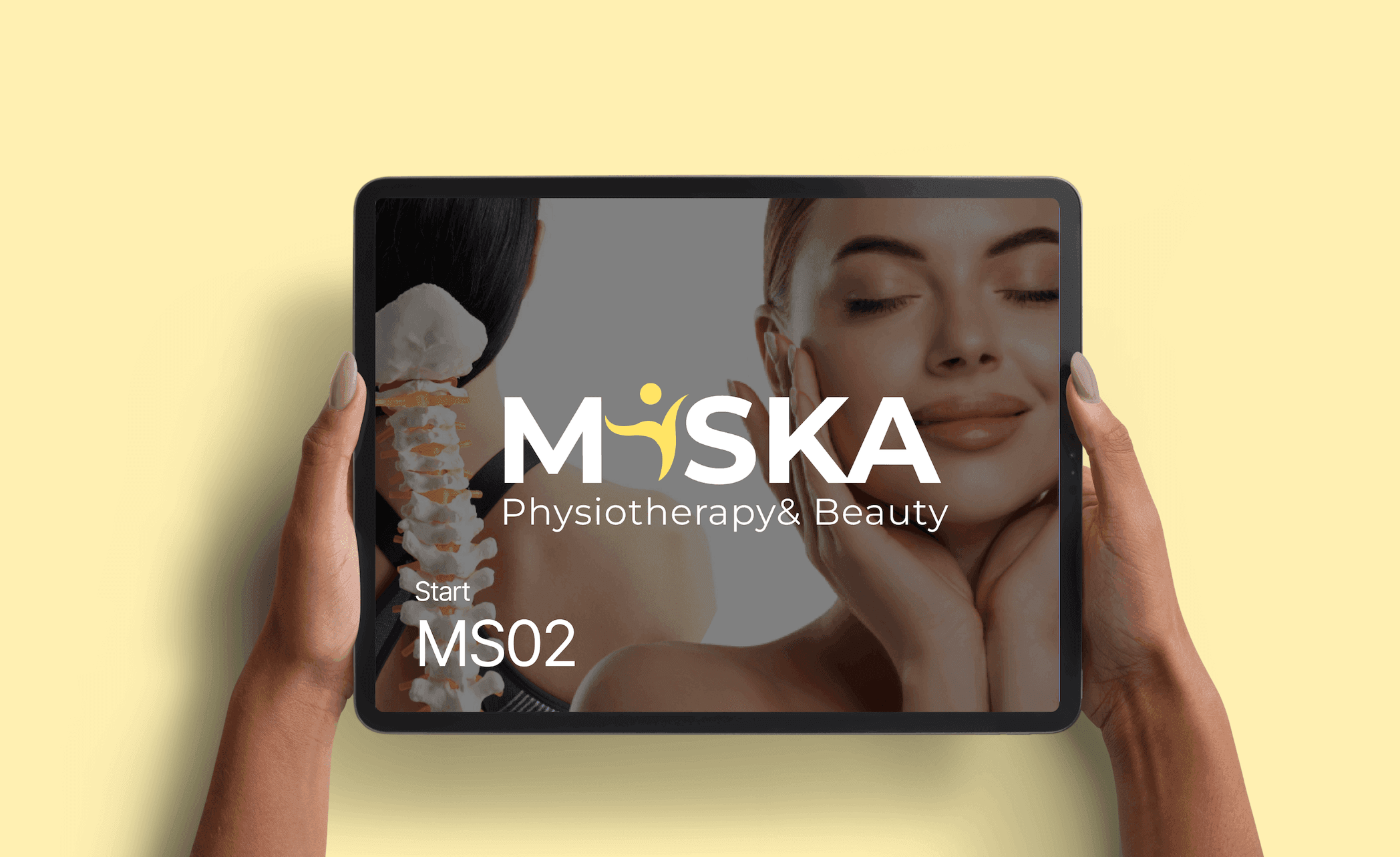
Miska is a wellness brand offering both physiotherapy and beauty treatments. The goal was to design a logo that feels professional, modern, and balanced, showing both health and beauty.
- Client
- Miska
- Discipline
- Brand identity
- Services
- Logo Design, Brand Identity Design, Typography Selection, Color Theory, Visual Storytelling
Problem
The client needed a brand identity that clearly represented two different services:
- Physiotherapy: professional, medical, trustworthy.
- Beauty treatments: elegant, modern, relaxing.
Before the redesign, it was difficult for people to see both sides of the business in one brand.
Solution
The new logo solves this by:
- Using a human figure to represent movement, healing, and vitality (physiotherapy).
- Pairing it with modern, clean typography and soft imagery to reflect beauty and care.
- Creating a balanced identity that works for both medical trust and beauty elegance.
Concept
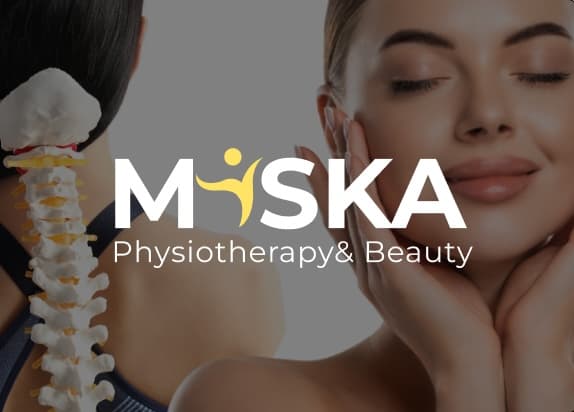
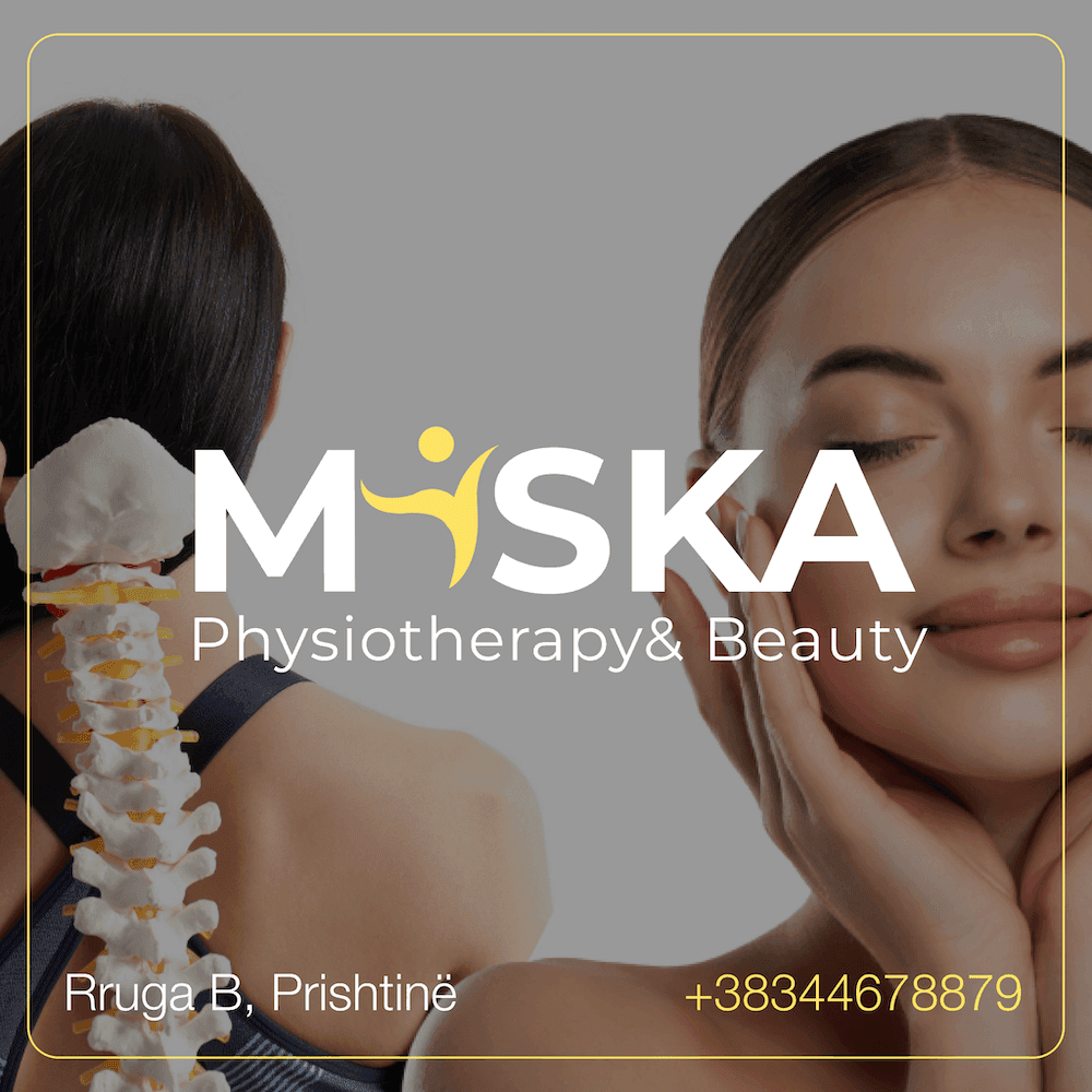
The word MISKA is bold and modern, which gives trust and clarity.
- The yellow figure inside the “S” represents movement, flexibility, and vitality.
- The yellow color adds positivity and energy.
- Supporting imagery (spine and face) highlights both physiotherapy and beauty care.
Colors & style
- Yellow: Energy and positivity.
- White: Clean and simple.
- Black/Dark Gray: Strength and professionalism.
Social media designs
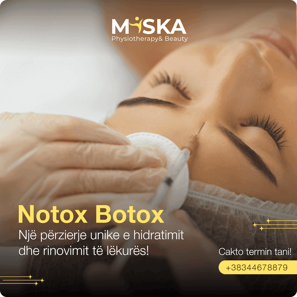
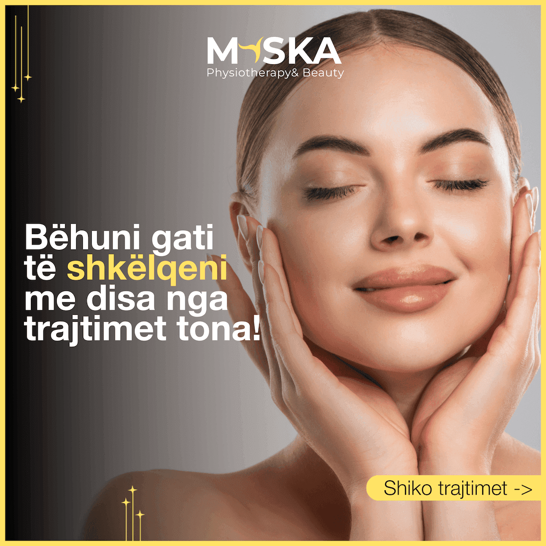
Created a series of visually engaging Instagram posts tailored for brand storytelling and audience growth. The designs focused on clear typography, bold color use, and balanced layouts to ensure strong visual impact. Each post was optimized for mobile viewing, brand consistency, and audience engagement, blending creativity with strategic communication.
Gallery


In detail
Logo Design
The logo was crafted to visually merge both physiotherapy and beauty into one cohesive mark.
- The yellow figure inside the letterform symbolizes movement and vitality.
- Bold, modern typography communicates trust and professionalism.
- The mark works across digital and print at any scale.
Brand Identity Design
A complete brand system was developed to ensure consistency across all touchpoints.
- Business cards, letterheads, and social templates were designed as a unified kit.
- Brand guidelines document ensures future materials stay on-brand.
- Every element reinforces the dual identity of health and beauty.
Typography Selection
Font choices were made to balance medical authority with beauty elegance.
- Montserrat Bold for the logo: geometric, strong, and highly legible.
- Montserrat Regular for the tagline: clean and approachable.
- Consistent type hierarchy across web, social media, and print.
Color Theory
The palette was chosen to evoke energy, trust, and calm simultaneously.
- Yellow (#FFE365): energy, optimism, and warmth for the human figure.
- White: purity, cleanliness, and simplicity for the brand text.
- Dark gray/black: strength, professionalism, and a premium feel.
Visual Storytelling
Every visual asset was designed to tell the story of wellness and transformation.
- Imagery combines human movement with beauty and self-care visuals.
- Social media posts use a narrative arc: before, during, and after treatment.
- Each design balances information with emotion to drive engagement.