Brand identity
Divergent Brand Design
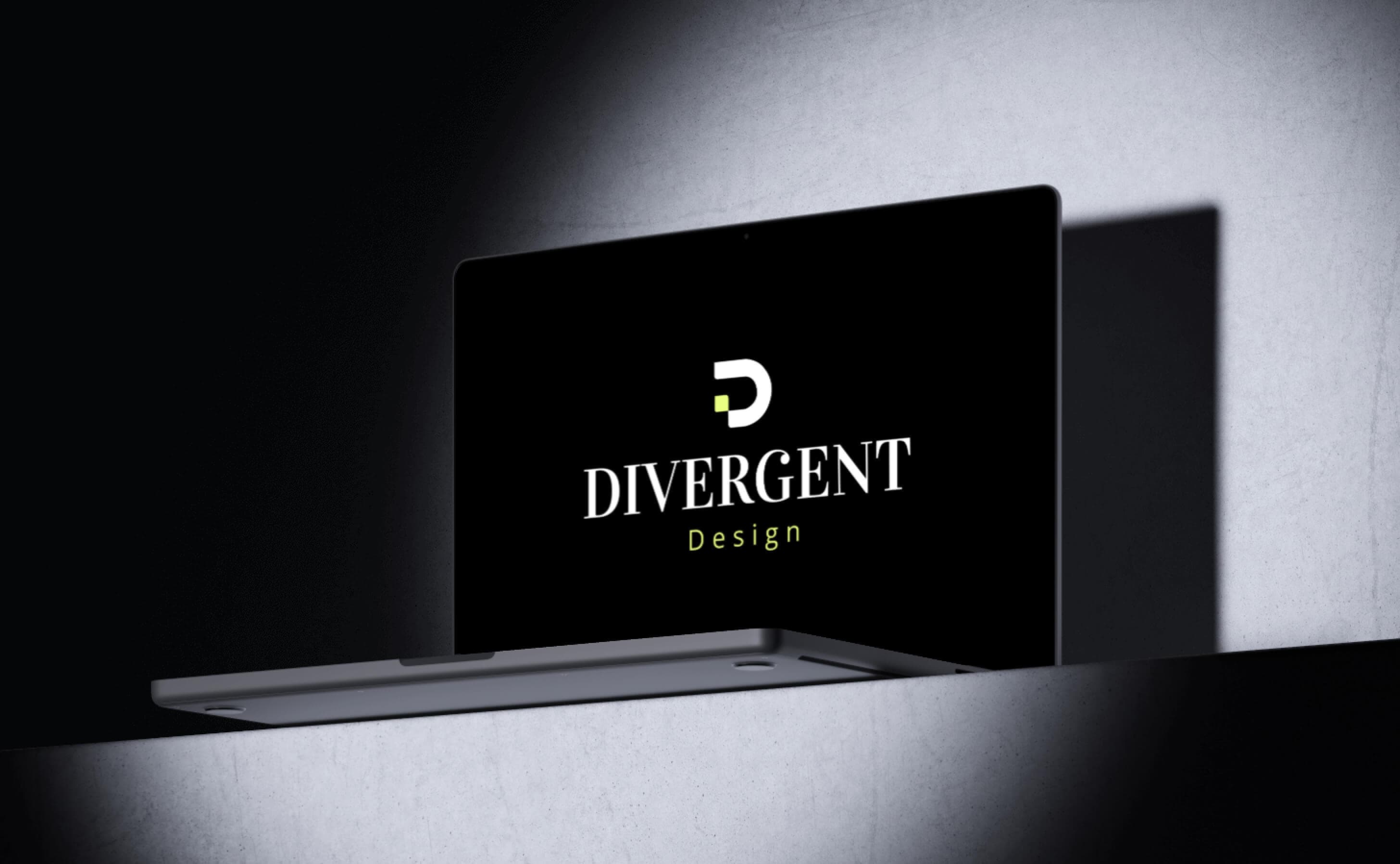
A bold, unconventional brand identity built for a company that refuses to blend in. Divergent Brand Design explores the tension between structure and chaos, crafting a visual system that is disciplined in its construction yet fearless in its expression.
- Discipline
- Brand identity
- Services
- Brand Identity, Logo Design, Typography, Color Systems, Brand Guidelines
Concept
The Divergent identity is built on the principle of controlled rebellion. Every element — from the logo to the typography to the color palette — is designed to feel like it is breaking a rule while actually following a rigorous underlying system. The brand should feel alive, energetic, and impossible to ignore.
- Angular, geometric forms that suggest disruption and forward momentum
- A dynamic logo system with multiple variations that adapt to context without losing recognition
- Intentional asymmetry in layouts that creates visual tension and draws the eye
- A tone of voice that is confident, direct, and unapologetically bold
Colors & style
- Primary palette: deep charcoal base with vibrant orange (#ff6b35) as the signature accent — energetic and impossible to miss
- Secondary tones: slate gray, off-white, and a muted coral for softer applications
- Typography: a sharp, condensed display font for headlines paired with a clean grotesque for body copy
- Texture and pattern: diagonal line patterns, halftone dots, and subtle grain overlays add depth and grit
Design process
The branding process was driven by a deep exploration of what it means to diverge — to break from convention while maintaining credibility. I studied brands across industries that successfully balance boldness with professionalism, then developed a visual vocabulary that captures that same energy with its own distinct character.
Problem
The client operated in a competitive market where every brand looked and sounded the same — safe, corporate, and forgettable.
- The existing visual identity was generic and interchangeable with dozens of competitors
- There was no cohesive brand system — materials looked different depending on who created them
- The brand's bold, disruptive personality was not reflected in any of its visual touchpoints
- Without clear guidelines, every new piece of collateral required design decisions from scratch
The brand needed a complete visual overhaul — not just a new logo, but a comprehensive identity system that empowers anyone on the team to create on-brand materials with confidence.
Solution
I developed a complete brand identity system from the ground up, rooted in the company's rebellious spirit and built for practical, everyday use across all media.
- Designed a primary logo, wordmark, and icon with a modular construction that allows dynamic variations for different contexts
- Created a comprehensive color system with primary, secondary, and accent palettes plus clear usage ratios and accessibility guidelines
- Developed a typographic hierarchy covering headings, subheadings, body text, captions, and UI elements across print and digital
- Produced a 60-page brand guidelines document with rules, examples, and templates for consistent application
Brand Identity Package
The complete brand identity package includes the primary logo and all responsive variants, a full color system with digital and print specifications, a licensed typography suite, a 60-page brand guidelines document, and a starter kit of templates for business cards, letterheads, presentations, social media, and merchandise. Every asset is delivered in production-ready formats, organized for immediate implementation by the client's team.
In detail
Brand Identity
The identity system is designed to be both instantly recognizable and endlessly flexible, adapting to any medium without losing its core character.
- Developed a brand strategy framework defining mission, vision, values, and personality attributes
- Created a visual identity system spanning logo, color, typography, imagery, and graphic elements
- Designed brand applications including business cards, letterheads, email signatures, and social media templates
- Built a brand architecture that scales from the parent brand to sub-brands and product lines
Logo Design
The logo is the cornerstone of the identity — a mark that communicates the brand's essence in a single glance.
- Explored over 40 initial concepts through sketching and rapid digital prototyping before narrowing to three directions
- Developed the final mark using a custom geometric grid ensuring mathematical precision in every proportion
- Created a responsive logo system with four variants: full lockup, wordmark, icon, and favicon
- Defined clear space rules, minimum sizes, and incorrect usage examples to protect brand integrity
Typography
The typographic system balances expressive display type with functional body copy, creating a reading experience that matches the brand's energy.
- Selected and licensed a primary display typeface that captures the brand's bold, angular character
- Paired it with a versatile sans-serif family for body text, UI elements, and data-heavy contexts
- Defined a complete type scale with sizes, weights, line heights, and letter spacing for both print and screen
- Created typographic layout templates demonstrating how to combine type styles in real applications
Color Systems
The color palette is engineered to be vibrant and distinctive while meeting accessibility standards across all applications.
- Defined primary, secondary, and neutral color families with precise values in HEX, RGB, CMYK, and Pantone
- Created color usage ratios (60/30/10 rule) ensuring consistency without monotony
- Tested all color combinations against WCAG 2.1 AA and AAA contrast requirements
- Designed dark mode and light mode variants with equivalent visual impact and readability
Brand Guidelines
The brand guidelines document is the single source of truth — a practical, living reference that empowers the entire team to create on-brand work.
- Produced a 60-page guidelines document covering every aspect of the visual identity
- Included do's and don'ts with real examples showing correct and incorrect usage
- Created downloadable template packs for presentations, social media, print collateral, and merchandise
- Built the guidelines as a living digital document with version control for future updates