Editorial
Zane Cover
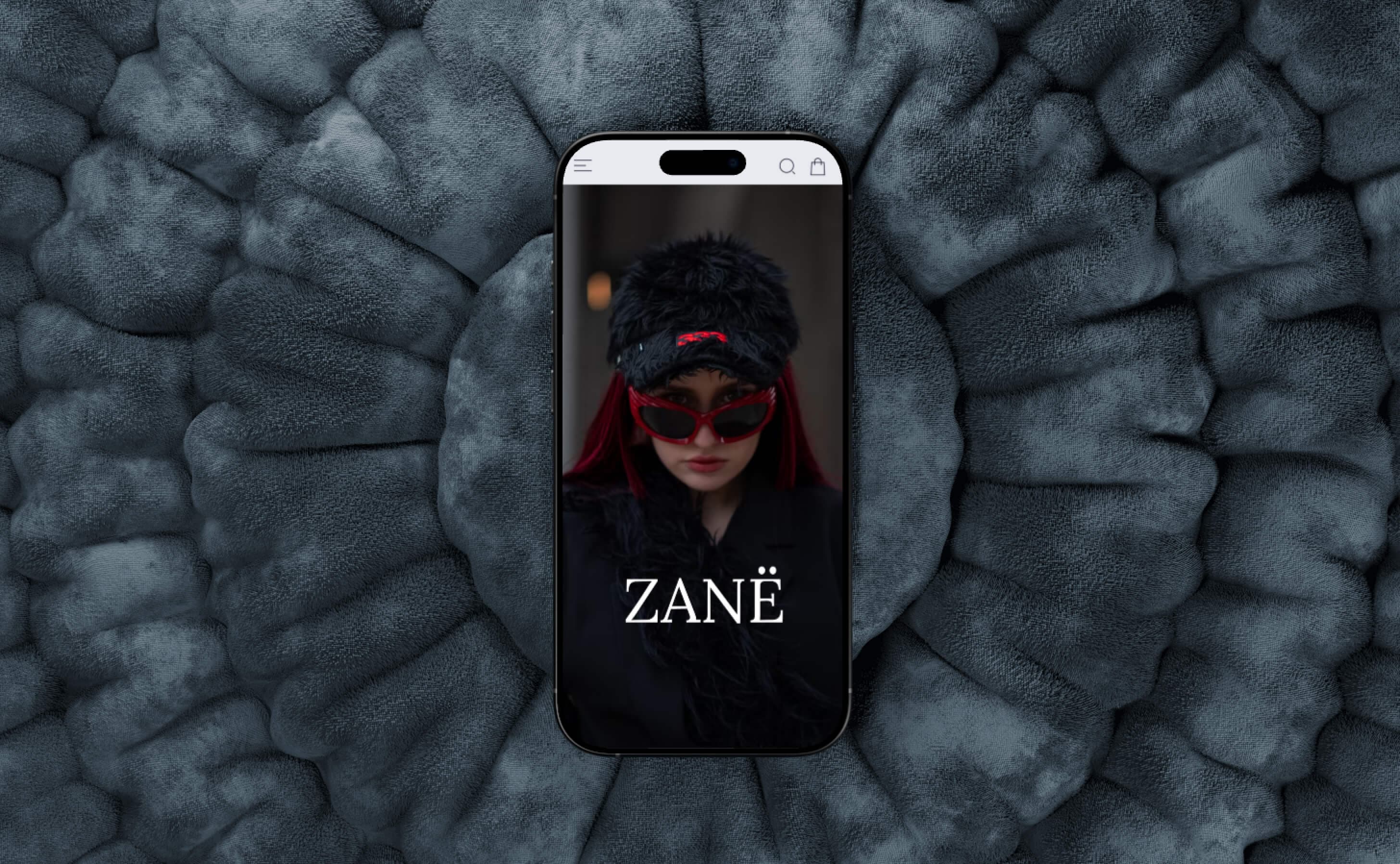
A modern, artistic cover design that fuses bold typography with evocative photo manipulation to create a visual experience that demands attention. The Zane Cover project explores the intersection of editorial design and fine art, pushing the boundaries of what a cover can communicate.
- Discipline
- Editorial
- Services
- Cover Design, Photo Manipulation, Typography Art, Visual Composition, Creative Direction
Concept
The Zane Cover is built on the idea that a cover is not merely a wrapper — it is the first act of the story. The design uses layered imagery, dramatic lighting, and expressive typography to create an emotional entry point that pulls the viewer into the narrative before a single word is read.
- Layered compositions that create depth and mystery through overlapping visual planes
- A cinematic color palette with dramatic contrasts between light and shadow
- Typography that functions as both text and image, integrated into the visual composition
- Symbolic imagery that hints at the content's themes without giving away the narrative
Colors & style
- Primary palette: deep blacks and rich purples with electric magenta (#e040fb) as the signature highlight
- Secondary tones: midnight blue, dusty rose, and silver for atmospheric depth
- Typography: a custom-modified display typeface with dramatic weight contrasts and expressive letter forms
- Photographic style: moody, high-contrast imagery with selective color grading and intentional grain
Design process
The creative process was highly exploratory, beginning with mood boards and visual experiments that tested different emotional territories. I worked through dozens of compositional studies, layering photographs, textures, and type in different configurations until the design found its voice — a balance between restraint and expressiveness that feels both curated and raw.
Problem
In a saturated visual landscape, covers face an enormous challenge: they must capture attention in a fraction of a second while conveying depth, quality, and emotional resonance.
- Generic stock photography and templated layouts make most covers visually interchangeable
- The trend toward minimalism has left many covers feeling sterile and emotionally flat
- Digital thumbnails demand designs that read clearly at extremely small sizes without losing impact
- Balancing artistic expression with commercial viability often results in compromised, middle-ground designs
The project needed a cover that is unmistakably unique — one that works as a piece of visual art while still fulfilling its commercial function of attracting and engaging the right audience.
Solution
I created a cover design that operates on multiple visual levels — arresting at thumbnail size, rewarding at full scale — through a combination of custom photo manipulation, hand-crafted typography, and meticulous compositional balance.
- Developed a multi-layered composition technique combining original photography, digital painting, and textural overlays for a rich, dimensional feel
- Created custom typographic treatments where letterforms interact with the imagery — partially obscured, integrated into the visual depth
- Designed the composition to maintain impact across all formats: physical print, digital storefront thumbnails, and social media previews
- Produced multiple colorway variants allowing the design to adapt for different editions, markets, or promotional contexts
Cover Artwork
The final cover artwork package includes the primary cover design in full-wrap and front-only formats, a digital-optimized variant for online storefronts and social media, three alternate colorway editions, the custom-modified typeface files, and all layered source files for future adaptations. Each deliverable is provided in print-ready and screen-optimized formats with detailed production specifications.
In detail
Cover Design
The cover design process balanced artistic ambition with the practical demands of commercial publishing and digital distribution.
- Researched market trends and competitor covers to identify visual white space and differentiation opportunities
- Created the design across three formats: front cover, full wrap (front, spine, back), and digital-only variant
- Ensured all text elements — title, author name, taglines — are legible at 100px thumbnail size
- Delivered print-ready files with bleed, trim marks, and color profiles for both offset and digital printing
Photo Manipulation
Custom photo manipulation transforms raw photography into something otherworldly — elevating the cover from a simple image to a visual experience.
- Composited elements from multiple photographic sources into a seamless, unified scene
- Applied advanced retouching techniques including frequency separation, dodge and burn, and selective color grading
- Created surreal atmospheric effects — light leaks, particle systems, and volumetric haze — to add emotional depth
- Maintained a balance between manipulation and authenticity, ensuring the imagery feels evocative rather than artificial
Typography Art
The typographic treatment elevates letterforms from functional text to integral visual elements of the composition.
- Modified an existing display typeface, customizing key letterforms to match the project's visual language
- Created depth interactions where type passes behind foreground elements, establishing spatial relationships
- Experimented with distortion, texture mapping, and transparency effects to integrate type with imagery
- Designed fallback typographic layouts for contexts where the artistic treatment cannot be reproduced
Visual Composition
The compositional structure is the invisible architecture of the cover — guiding the viewer's eye and creating emotional impact through spatial relationships.
- Used classical compositional principles — rule of thirds, golden spiral, and dynamic symmetry — as a structural foundation
- Created a clear visual hierarchy: dominant image, title, author name, secondary text, each with defined weight and position
- Designed negative space intentionally, allowing the composition to breathe and giving the eye resting points
- Tested the composition at multiple scales and aspect ratios to ensure it holds together across all viewing contexts
Creative Direction
The creative direction shaped the project's vision from initial concept through final execution, ensuring every decision served the larger artistic goal.
- Developed the initial creative brief defining the emotional territory, visual references, and design principles
- Directed the photography session, specifying lighting, wardrobe, and posing to align with the compositional plan
- Curated the color palette and atmospheric tone through iterative mood boarding and reference gathering
- Made final decisions on composition, type placement, and color grading through a structured review process