← Case studies
Home / 2025 / Example
Northfold
Making a 3-pack read as a 3-pack at thumbnail size
A shouty main image hid the product in a grey box. The redesign lets the bins fill the frame and puts fit and load capacity in the first three swipes.
- Client
- Northfold
- Category
- Home
- Year
- 2025
- Scope
- Main Image, Secondary Images, Infographics, A+ Content
+41%Click-through rate
(01)Before / after— Main image
Theproblem.
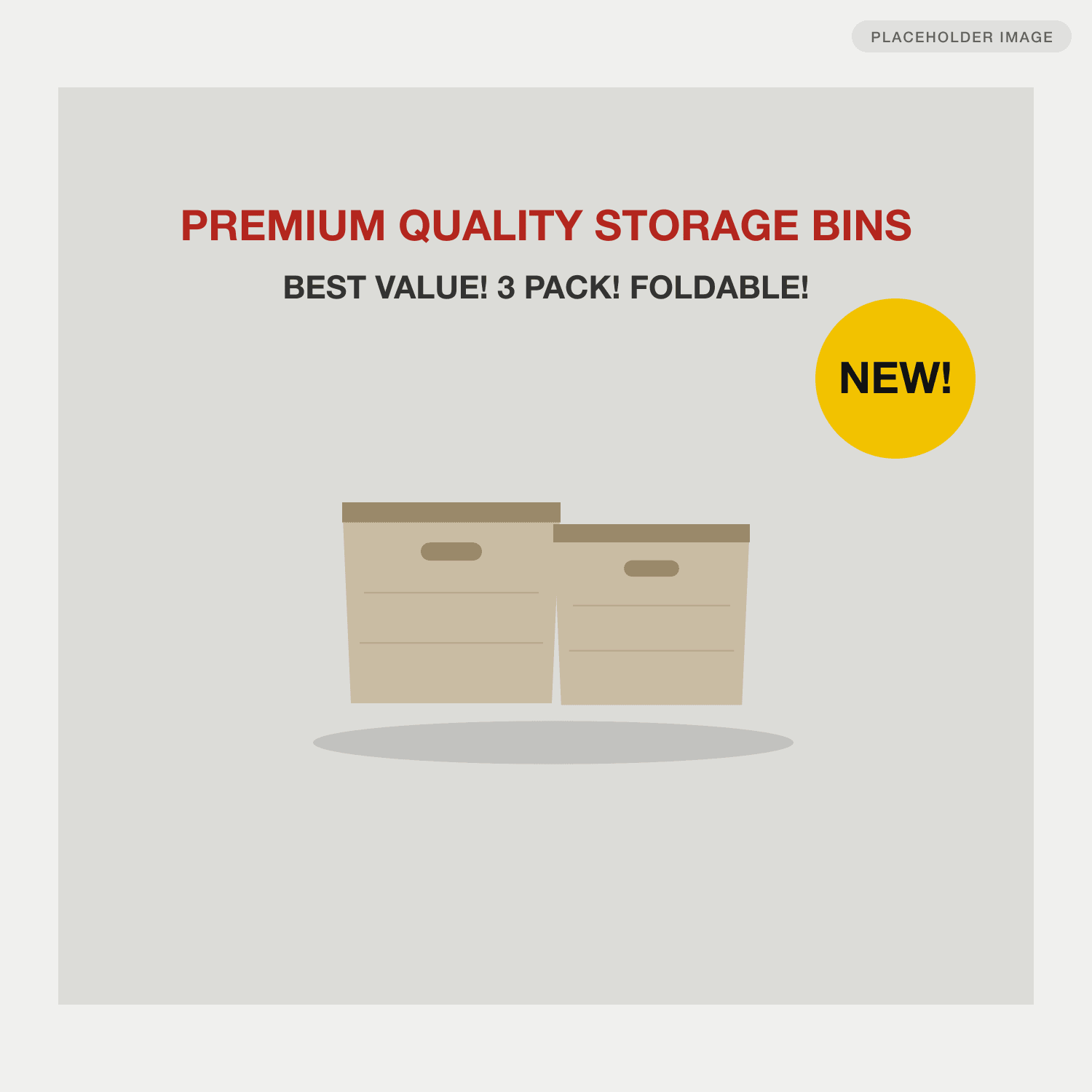
- 01The main image used 40% of the frame on the product and the rest on badges and all-caps claims, so it looked like two bins, not three.
- 02The top review complaint was bins sagging under weight, and nothing in the gallery answered it.
- 03Returns clustered on 'does not fit my shelf', but no image showed dimensions.
Drag, or use the arrow keys, to compare.
(02)As shoppers saw it— The original listing
Before.
01Main image 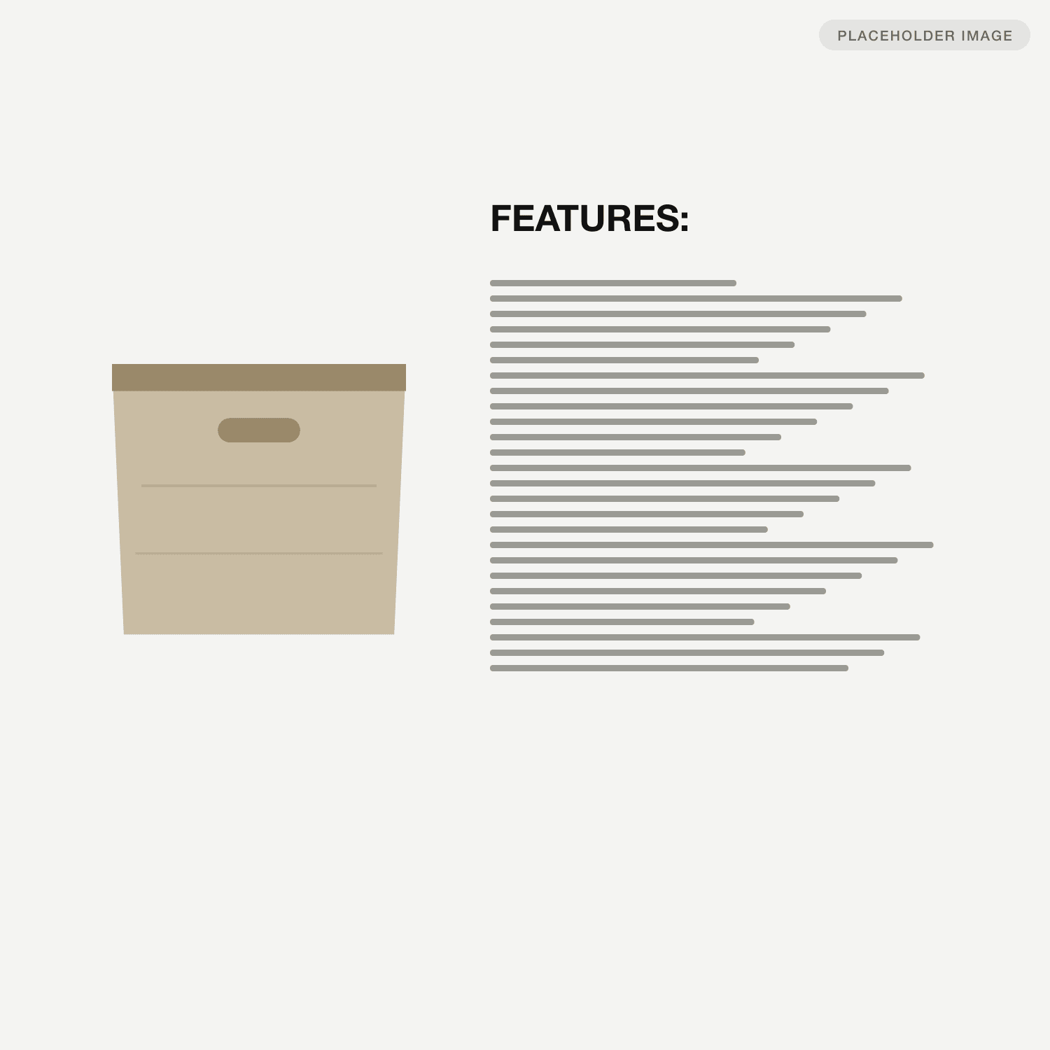
02Secondary image 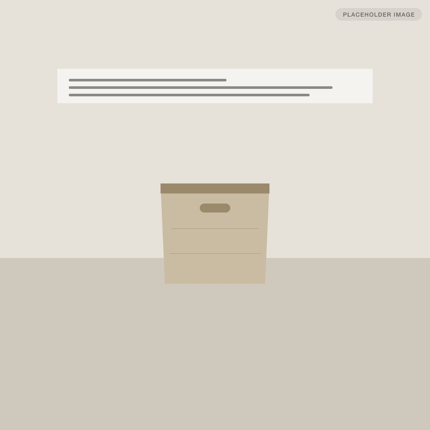
03Lifestyle
(03)Tap a marker for the reasoning— The teardown
After,annotated.
(01) Main image3 notes
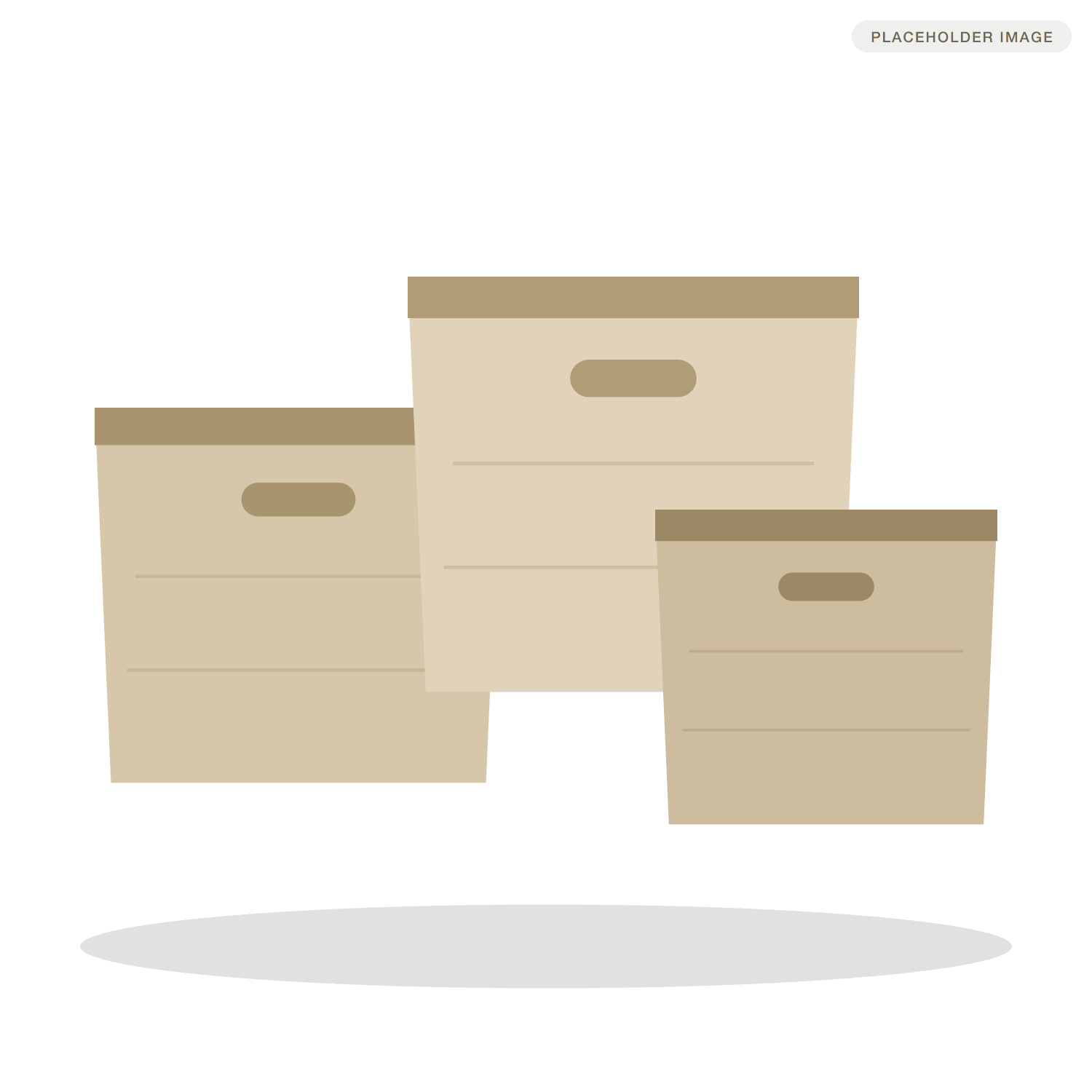
- The product fills about 85% of the frame, so it still reads as three bins at thumbnail size.
- Three sizes nested in one shot answers 'what is in the pack' before the click.
- Pure white with a soft contact shadow: compliant, but grounded instead of floating.
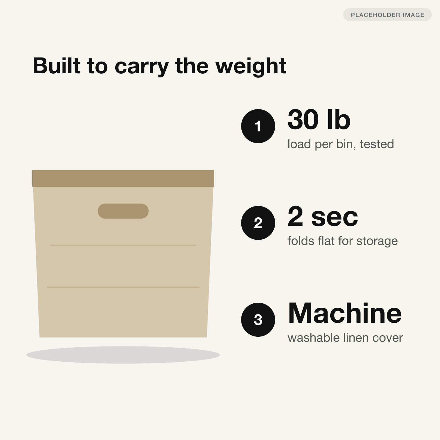
(02) Infographic3 notes
- The headline answers the top review complaint (sagging) directly.
- One number per benefit, set large enough to survive a 320 px wide phone gallery.
- Numbered badges set a reading order, so the eye goes 1, 2, 3 instead of scanning.
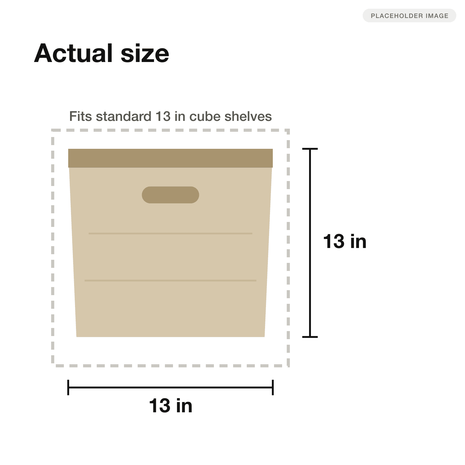
(03) Size and scale2 notes
- The dashed shelf outline shows the fit, which was the most common return reason.
- Dimensions on both axes, in inches, the unit these buyers search in.
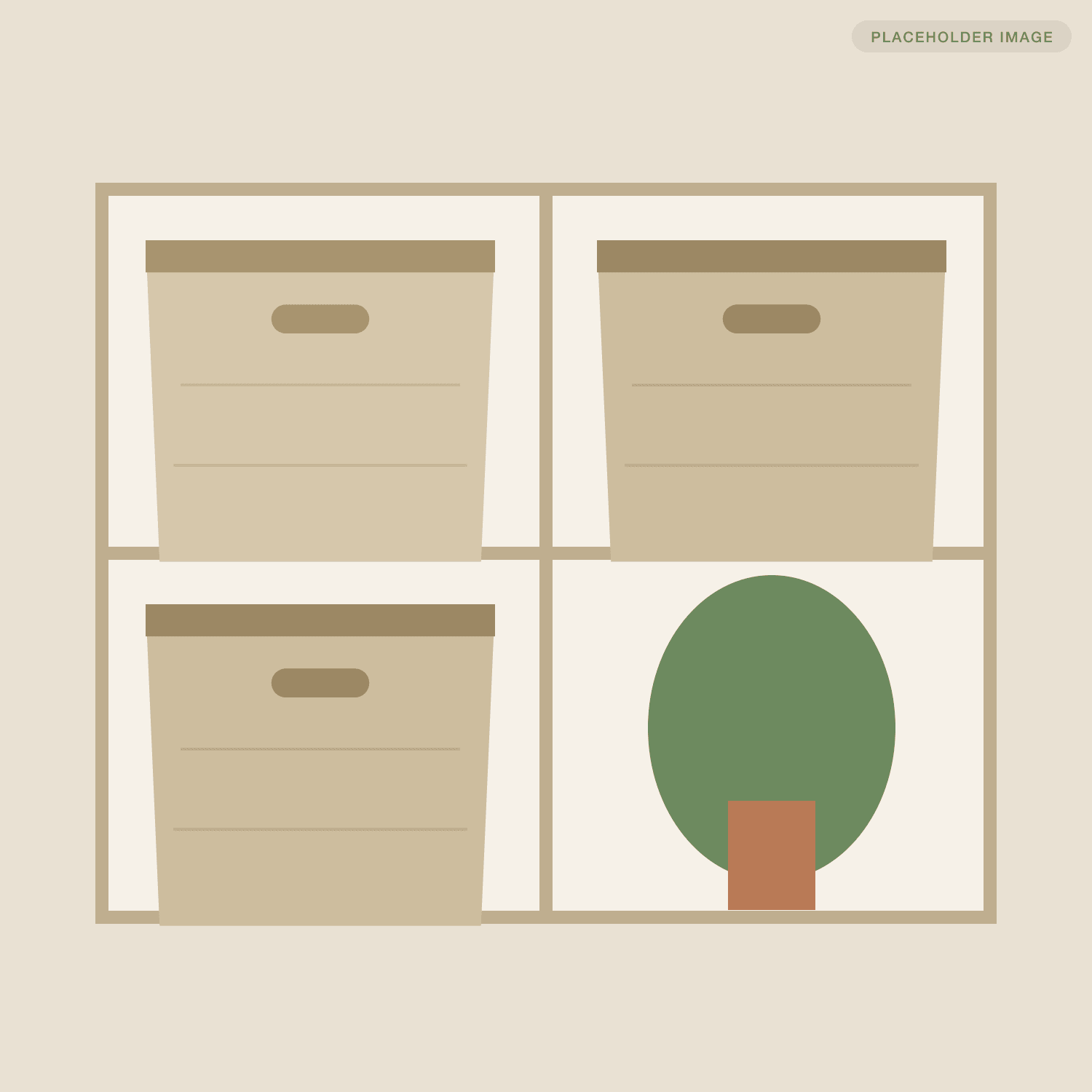
(04) Lifestyle1 note
- Shown in the shelf they are bought for. A plant gives scale without narrowing the audience.
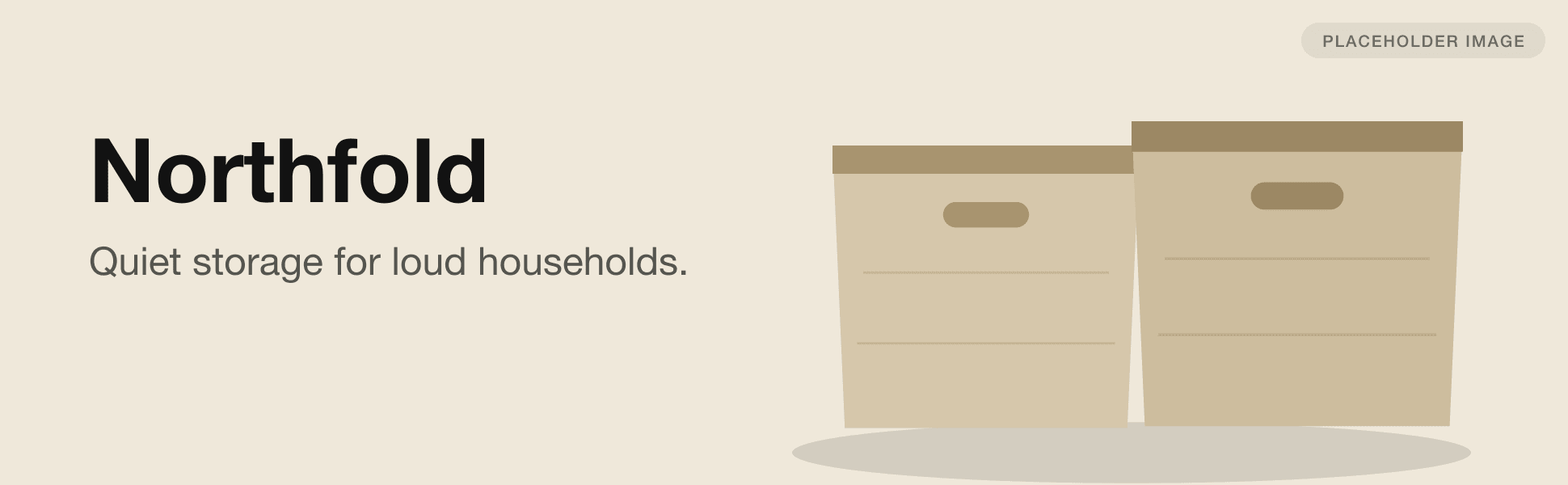
(05) A+ content2 notes
- The A+ banner sells a mood. The features already live in the gallery.
- The crop repeats the main image colours so the page feels like one system.
(04)60 days after launch compared with the 60 days before— Results
What itdid to the numbers.
- +41%
- Click-through rate0.38% to 0.54%
- +27%
- Conversion rate9.8% to 12.4%
- -18%
- Return rateFit-related returns
Example study. Numbers are placeholders.
“We had tested badges, price, coupons. Nobody told us the product was just too small in the photo.”
(05)— Next case study
Calmwell: Selling the outcome, not the ingredient +22% Conversion rate