← Case studies
Supplements / 2025 / Example
Calmwell
Selling the outcome, not the ingredient
The listing led with chemistry and hid the label. The redesign leads with sleep, puts the label at readable size and answers dosage in the headline.
- Client
- Calmwell
- Category
- Supplements
- Year
- 2025
- Scope
- Listing Audit, Main Image, Infographics, A+ Content
+22%Conversion rate
(01)Before / after— Main image
Theproblem.
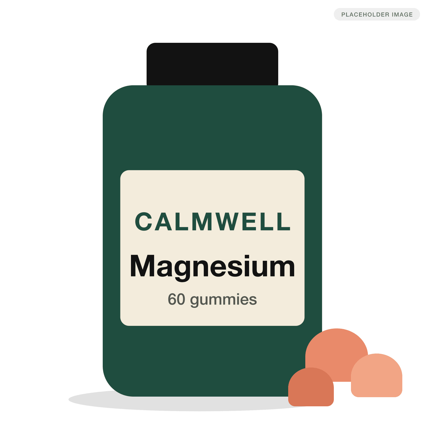
- 01At thumbnail size the bottle was a green rectangle. 'Magnesium' was unreadable in search results.
- 02Secondary images were walls of text and a supplement facts panel, both unreadable on mobile.
- 03Q&A was full of 'how many do I take' and 'is this a pill', questions the images should have answered.
Drag, or use the arrow keys, to compare.
(02)As shoppers saw it— The original listing
Before.
01Main image 
02Secondary image 
03Secondary image
(03)Tap a marker for the reasoning— The teardown
After,annotated.
(01) Main image3 notes
- The bottle fills 85% of the height. The old image used about 30%.
- Label type rebuilt at twice the size so 'Magnesium' reads in search results.
- Gummies in frame answer 'is this a pill?' before anyone asks.
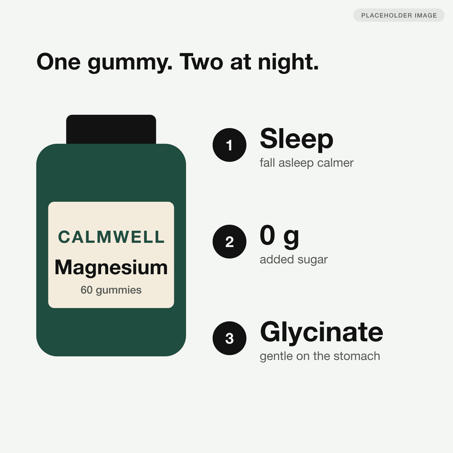
(02) Infographic3 notes
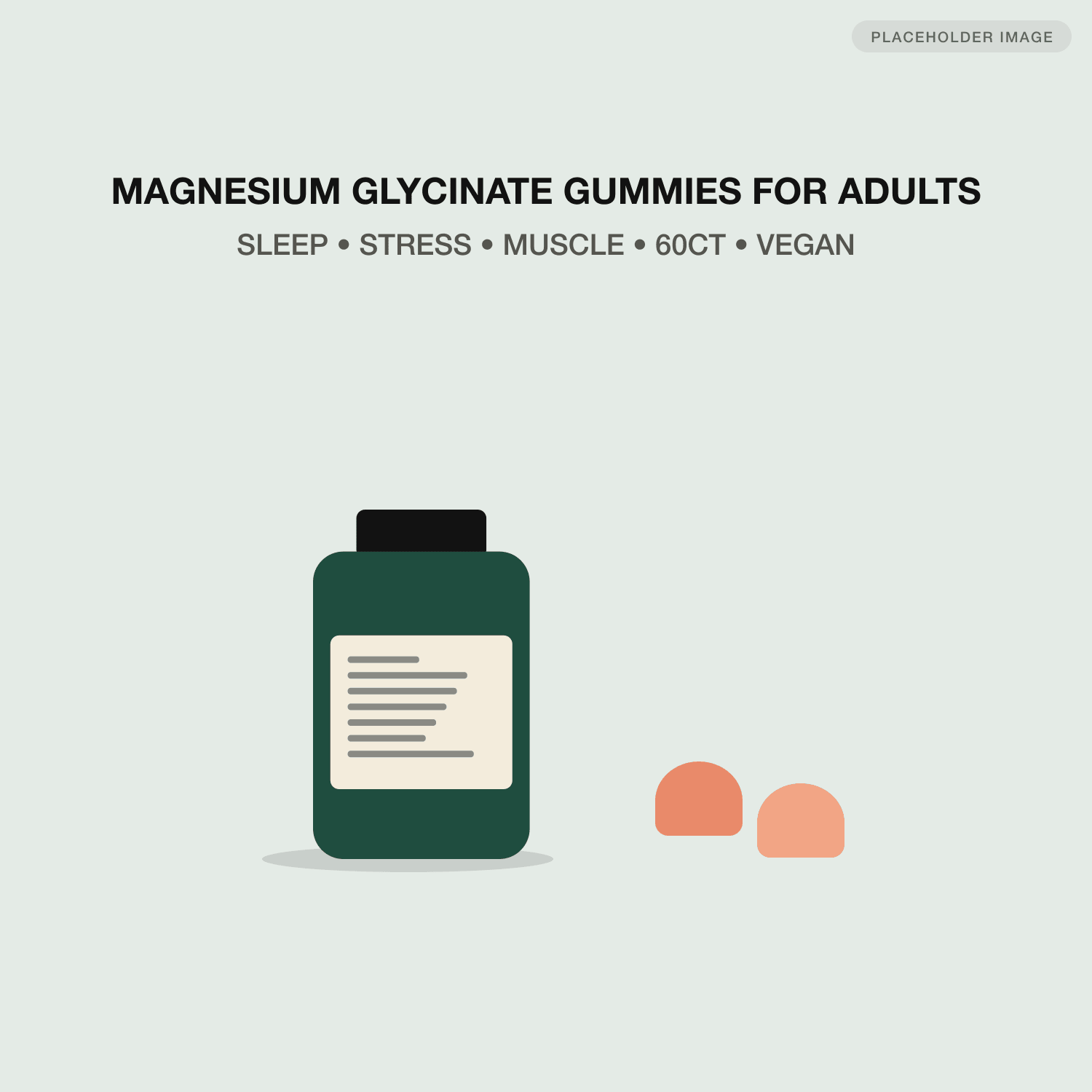
- Dosage in the headline removes the most common Q&A question.
- It leads with the outcome people search for, sleep, not the compound name.
- '0 g added sugar' targets the top competitor's weakest review theme.
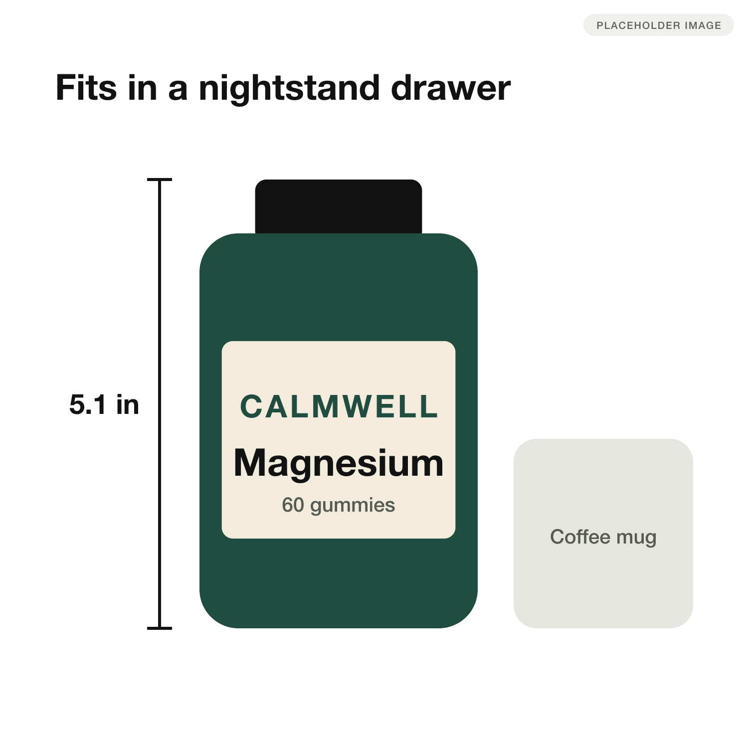
(03) Size and scale2 notes
- Height in inches, marked on the product rather than in a caption.
- A mug gives instant scale. Nobody needs a ruler to picture it.
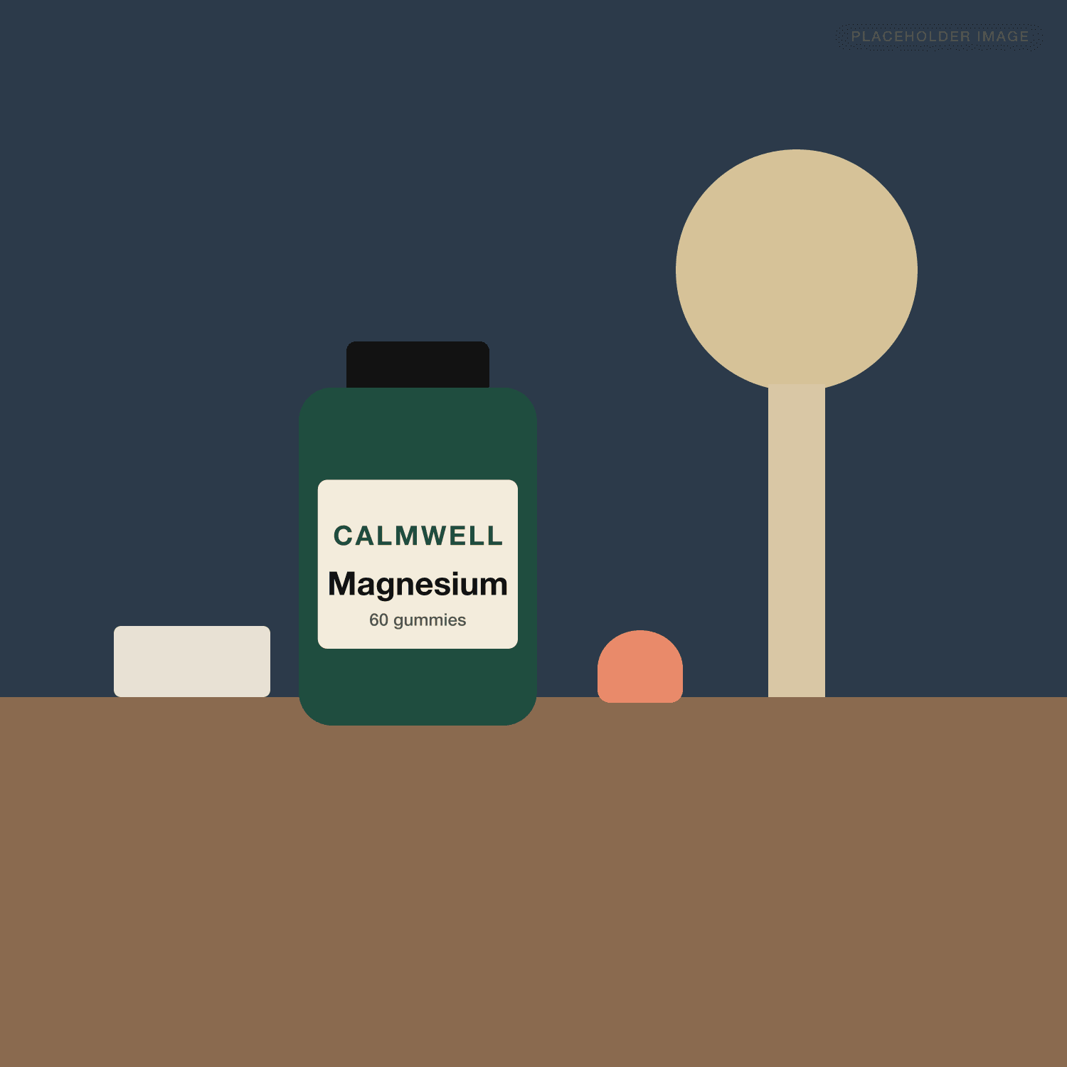
(04) Lifestyle1 note
- A nightstand at dusk sells the ritual. The palette stays inside the brand green.
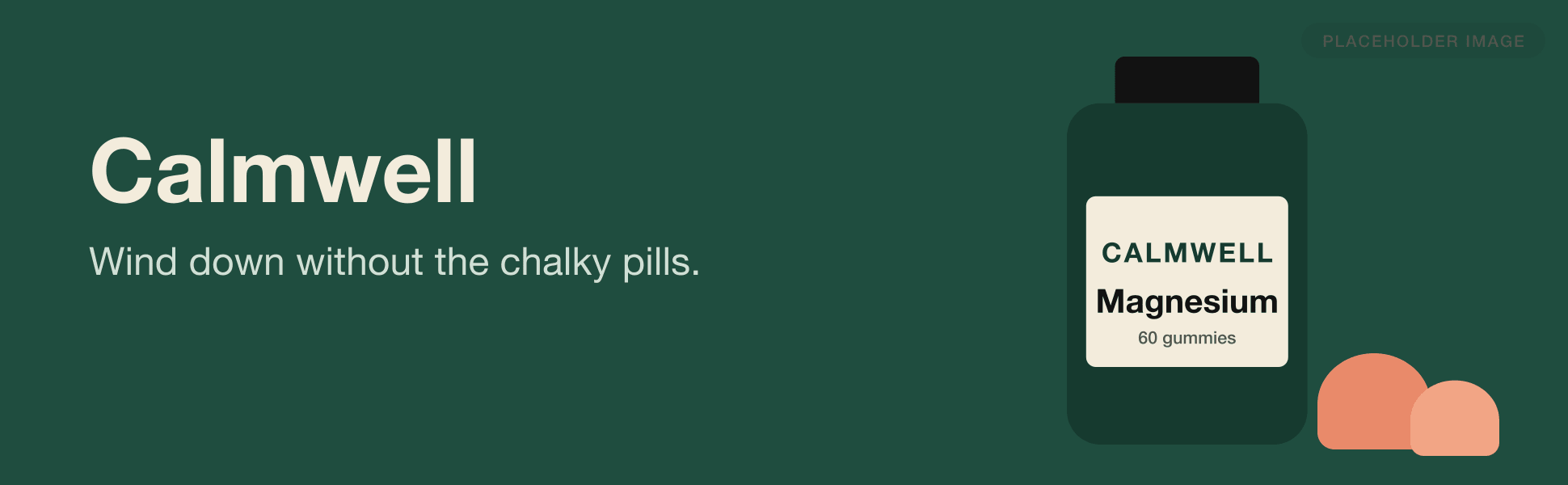
(05) A+ content2 notes
- The tagline names the alternative buyers are leaving: chalky pills.
- Full-bleed brand green makes the A+ section feel premium without a Premium A+ budget.
(04)45 days after launch compared with the 45 days before— Results
What itdid to the numbers.
- +22%
- Conversion rate14.1% to 17.2%
- +33%
- Click-through rate0.42% to 0.56%
- +19%
- SessionsSame ad spend
Example study. Numbers are placeholders.
“The dosage headline alone cut our 'how many do I take' questions to almost zero.”
(05)— Next case study
Vessel: Turning a spec sheet into a reason to buy +38% Conversion rate